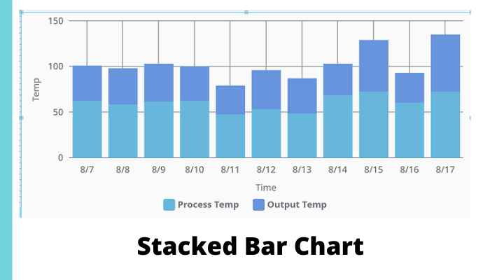
Our goal is to plot both process temp and outside temp represented as bars, one on top of the other, aka a stacked bar chart. A successful implementation will look like figure 1 which displays process temp & output temp as stacked bars.

Figure 1
Here are some detailed steps for creating a stacked bar chart in perspective:
Step: #1

Figure 2
First, we need to start with the X & Y chart,
The default timeseries bar chart does look like a stacked bar chart however, it has limitations.
Figure 2 shows one of the biggest limitations of the time series bar chart. The width of the bar chart is calculated automatically based on the amount of data already on the x- axis, so if you have sparse data with a wide time range then this bar chart will end up as thin vertical lines.
Step: #2
Next we need to check how the database is configured.
The database needs to be configured with different categories that have columns.
Figure 3 shows an example of database data. If there are 2 different categories of alarms, then the database should have 2 separate columns matching the total number of alarms.
For example: Process Temperature & Output Temperature.

Figure 3
Step: #3
To keep things simple, let’s start with the dataset that comes with the default XY chart when you drag it in from the perspective components window. Figure 4 shows the default XY chart.

Figure 4
Step: #4
Next let’s change the Y-axis. Go to series 0 and 1, configure them to be plotted on the same Y-axis which is highlighted in figure 5.

Figure 5
Step: #5
Then figure 6 show that with both series 0 and 1 the ‘render’ property needs to be changed from line to the column.

Figure 6
Step: #6
Figure 7.1 should be the result of our efforts.

Figure 7.1
Now we must select a column and drill down into the column properties and get to: column/appearance/stacked
Then enable the box for stacked. This needs to be completed in both columns, see figure 7.2.

Figure 7.2
Step: #7
When both columns have their stacked properties checked, the chart will display the properly stacked bar chart as shown in figure 8.

Recommended Reading:
6 Things You Must Know That Showcase the Importance of Cybersecurity
The Use Scenarios for IIoT Edge Are Defined, but Not the Standards


